OCA Study Visit 6th February 2016 Tate Liverpool

This was the first OCA study visit I had attended.  It was to the Tate in Liverpool to see the Matisse exhibition, the constellations and an “Imagined Museum”.  Our tutor was Mark Clough.

There was so much to the day, and so much I could write about, but I need to focus in on real highlights and learning.

I will begin with Matisse.

Matisse

Studio Interior c.1903-4 Henri Matisse 1869-1954 Bequeathed by Lord Amulree 1984 http://www.tate.org.uk/art/work/T03889

This was one of the first paintings I viewed.  I like its intimacy and simplicity.  This is still life where one can imagine the artist at work quite literally painting a snapshot of the simple surroundings in front of him….a still life.  The colours are mostly simple, browns and greys, but the diagonals on the stool; the crossing batons on the right wall all lead the eye up to the jug of flowers and the fruit-the one splash of colour.  The beams of light coming in from the windows on the left illuminate the same objects.  It is clear this is an artists studio from the easel, the painting and the sculpture.  There is a still life within a still life!

This was said to be Matisse’s most characteristic work of that year, and was carried out at a time when he was attending both life drawing and sculpture classes, and wanting to demonstrate his skill (Tate 2016).

The Inattentive Reader 1919 Henri Matisse 1869-1954 Bequeathed by Montague Shearman through the Contemporary Art Society 1940 http://www.tate.org.uk/art/work/N05141

We studied the “inattentive reader” with our tutor, in order to explore the composition and wider learning of how to look at a painting.  As a first step he suggested always describing to ourselves what we see:

The colours- high colours here; lots of pinks.

Patternistic composition-no perpective; flat surfaces

Radical figure-very distorted, with almost no legs

Chair arm-organic

REPETITION PLUS CONTRASTS IN COMPOSITION

eg. repetitions of colours, lines, shapes

Contrasts such as busy and quiet areas; patterns/plain

Interesting negative spaces.

The four bronze backs were the part of the exhibition that had most impact for me.  These four sculptures, of a woman’s back were progressively reworked over about twenty years by Matisse.  Back 11 was only discovered after his death, and all four were cast in bronze posthumously.

Back I c.1909-10, cast 1955-6 Henri Matisse 1869-1954 Purchased 1955 http://www.tate.org.uk/art/work/T00081


Back II c.1913-4, cast 1955-6 Henri Matisse 1869-1954 Purchased with assistance from the Matisse Appeal Fund 1956 http://www.tate.org.uk/art/work/T00114
Back III c.1916-7, cast 1955-6 Henri Matisse 1869-1954 Purchased with assistance from the Matisse Appeal Fund 1957 http://www.tate.org.uk/art/work/T00160
Back IV 1930, cast 1955-6 Henri Matisse 1869-1954 Purchased with assistance from the Knapping Fund 1955 http://www.tate.org.uk/art/work/T00082


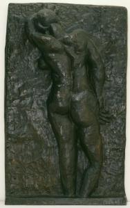
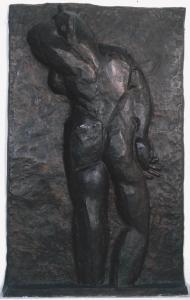
What really struck me over these was the progressive deconstruction of form.  The curved spine gradually disappears, becoming a rod like structure with dislocated hips by Back 3 and by back 4 the breast, hips and buttocks have completely disappeared into an androgynous, stylised totemic form reminiscent of some primitive art forms.

“Creativity is subtraction-choose what to leave out” (Kleon A 2012)

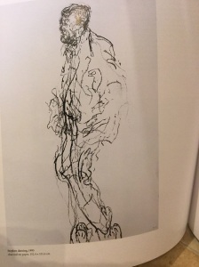
Intuitive versus analytical drawing

This stimulated a discussion and everyone found the balance challenging.  The tutor’s advice was intuitive drawing:

  1. Needs to NOT lose recognisable proportions
  2. OR use a light box; drawing over the drawing and then another page to work freely on-this helps get proportions right
  3. OR repeated drawings as Rodin did
  4. do whatever works
  5. Steal like an artist (Kleon 2012)
Rodins sketches Rodin 2006 Exhibition Catalogue RSA

“Work from your intuition and analyse with your intellect” (White K 2011)


Constellations

This part of the collection taught a lot about connections…the chains of influences amongst and between artists over time and also in the present.  Our tutor used this to begin to teach us about keeping better sketchbooks-one of my own learning needs.

He suggested getting work that has influenced us into our sketchbooks…speaking for ourselves with this…it is not necessary to “like” everything, but to help the tutor understand how we have got to where we have got.

Approaching sketchbooks:

  1. Look at your own work, then make the connections
  2. Pick out things you genuinely like-this makes it more resonant, more authentic
  3. Thinking….I like this….Why?  I don’t like this….Why?
  4. Stick postcards in…I like this…What?  Colours? The edges? Something else?
  5. Then use in your own work
  6. Demonstrate bigger connections (everything is connected !…..)

eg.  Modigliani’s “Little Peasant” and Cezanne’s “The Gardener Vallier”

The Little Peasant c.1918 Amedeo Modigliani 1884-1920 Presented by Miss Jenny Blaker in memory of Hugh Blaker 1941 http://www.tate.org.uk/art/work/N05269
The Gardener Vallier c.1906 Paul C?zanne 1839-1906 Bequeathed by C. Frank Stoop 1933 http://www.tate.org.uk/art/work/N04724

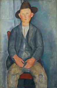
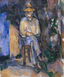
Here we were encouraged to look at the shade, tone and luminosity in each element in each painting, and to note similarities and differences.  Cezanne uses colour very differently, using big brush strokes with a single tone of colour.  Both use a basic colour theme of blue and orange.

Picasso Still Life

Bowl of Fruit, Violin and Bottle 1914 Pablo Picasso 1881-1973 Lent by the National Gallery 1997 http://www.tate.org.uk/art/work/L01895

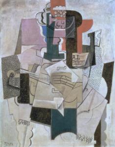
Composition: This is decorative cubist.  The repetition of the curved forms helps to unify the painting; as does the repetition of the dotted patterns which provide contrast (see notes above).

Colours: The green is mirrored above from below.  Colours are muted from a restricted palette (which can be very useful in unifying a painting eg 2 reds, 2 yellows, 2 blues, black and white).

These are everyday, still life themes…newspaper, the temporality of things like fruit.

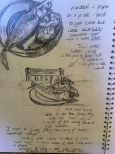
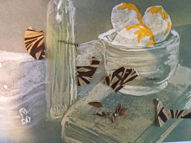
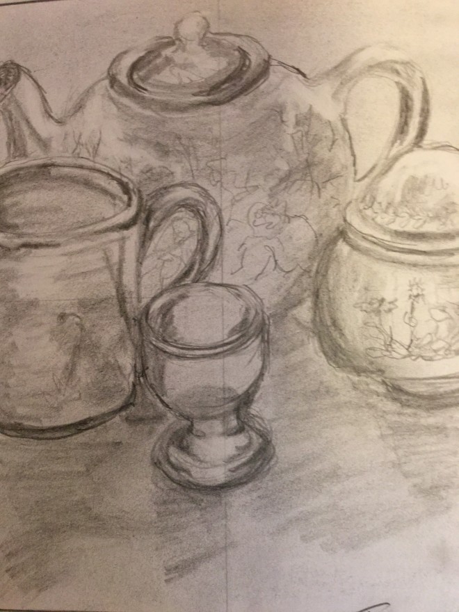
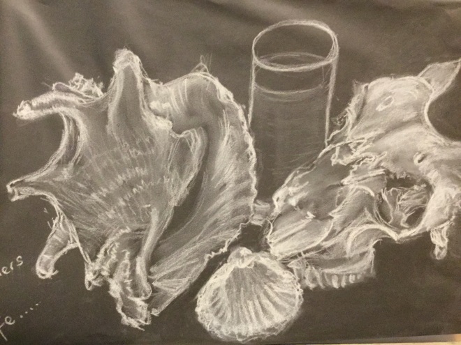
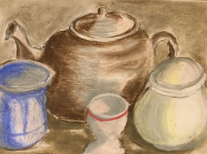
I had the idea for my multimedia still life partly from this painting (see here)

image

Morandi Still Life

Still Life 1946 Giorgio Morandi 1890-1964 Presented by Studio d'Arte Palma, Rome 1947 http://www.tate.org.uk/art/work/N05782
Still Life 1946 Giorgio Morandi 1890-1964 Presented by Studio d’Arte Palma, Rome 1947 http://www.tate.org.uk/art/work/N05782

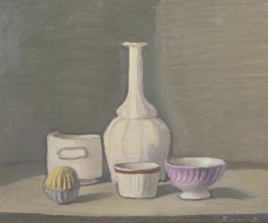
This is placed on the most simple, yet convincing of backgrounds.  The composition is triangular, edges are unfinished, and it is not quite clear what the objects are sitting on. Again the colours are muted from a restricted palette.  The foreground objects soft colours leap out in yellow, red and blue (although it looks lilac on the photograph.)  Brushstrokes are visible.

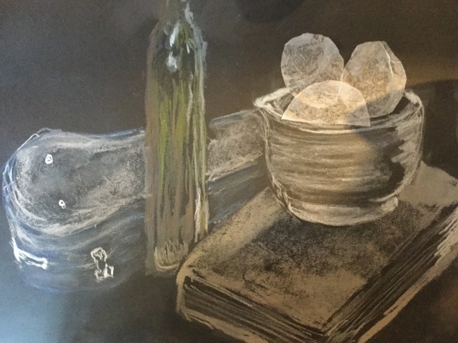
This painting inspired one of my tonal still life exercises here.

image


Sources:

Tate 2016 http://www.tate.org.uk/art/artworks/matisse-studio-interior-t03889/text-summary accessed 25 February 2016

Kleon A 2012 Steal Like an Artist Workman Publishing New York

White K 2011 101 things to learn in art school MIT Press Massachusettts

Rodin 2006 Exhibition Catalogue Royal Academy of Arts London

Images:

Matisse H Studio Interior c.1903-4 1869-1954 oil on canvas http://www.tate.org.uk/art/work/T03889 accessed 25 February 2016

Matisse H Back I c.1909-10, cast in bronze 1955-6 Henri Matisse 1869-1954 http://www.tate.org.uk/art/work/T00081 accessed 25 February 2016

Matisse H Back II c.1913-4, cast in bronze1955-6 Henri Matisse 1869-1954 http://www.tate.org.uk/art/work/T00114 accessed 25 February 2016

Matisse H Back III c.1916-7, cast in bronze 1955-6 Henri Matisse 1869-1954 http://www.tate.org.uk/art/work/T00160 accessed 25 February 2016

Matisse H Back IV 1930, cast in bronze1955-6 Henri Matisse 1869-1954 http://www.tate.org.uk/art/work/T00082 accessed 25 February 2016

Modigliani A The Little Peasant c.1918 oil on canvas  http://www.tate.org.uk/art/work/N05269 accessed 25 February 2016

Cezanne P The Gardener Vallier c.1906 oil on canvas http://www.tate.org.uk/art/work/N04724 accessed 25 February 2016

Picasso P Bowl of Fruit, Violin and Bottle 1914 Lent by the National Gallery 1997  http://www.tate.org.uk/art/work/L01895 accessed 25 February 2016

Morandi G Still Life 1946 http://www.tate.org.uk/art/work/N05782 accessed 25 February 2016

Project 4 Still Life Exercise 4 Monochrome still life

I started this project by choosing my objects.  My first choice (a trumpet and some other objects) was way too complex to tackle in the time we have, so I decided to do the crab I have been wanting to do ever since seeing van Goghs crabs at the National Museum.

The fishmonger had no crabs, so I ended up with a rather beautiful mackerel with complex and pronounced markings and a lovely almost rainbow shimmer in its skin.  I had a few fruits and vegetables, and after playing around, decided on a large red pepper and a relatively plain white plate to show them off more clearly.

These are the first sketches:

image

I then needed to explore colour and tonal variations.  I chose green as the colour and did some sketchbook experimentation, using tinted charcoal, inktense pencils, aquatone pencils, windsor and newton brilliant green ink and a couple of dip pens, along with a waterbrush.  I chose these media because they were less familiar (I am still learning with pen and ink, and the pencils had been unused.  The brushpen was also new for me)

image

After thinking about the work I had done, I decided to go for the more muted colours using two tones of aquatone green (sap green and emerald green) and dip pen with the green ink.  I took a photograph, made a grid and scaled up to a piece of rough Moulin de Ray watercolour paper I had found.  I chose this paper to get texture onto the fish, which was the main object in the drawing.  I did a very light pencil sketch first, before starting with the ink.

I had completed a short online course on using a sketchbook, and one of the items covered in some details was creating depth.  Things look closer when they are nearer the front of the drawing; when they are overlapping another object (which then looks further away) and when whatever is behind them is darkened, so they “pop” forwards.  (Heaston P 2016)

This is the result:

image

I think it looks like a fish on a relatively plain plate with a pepper and a chair.  Good to have contrast between fish (textured, patterned and reflecting light) and the plainness of the plate.  The pepper looks fat and succulent which it was.  The dark shadow between pepper and the streak of light across the top of the fish helps bring the fish forwards. The head works well, and the fish looks as fed up as he did on the table.  The rough paper added texture to the fish.   However the tail section could work better, as could the chair; the stem on the pepper is too dark…it needs lightening to bring it forwards more, and the finished piece is tighter than I had intended.  Although I am relatively inexperienced in these media I liked the looser effect in the sketchbook colour experimentation where I was drawing without any grid or pencil guidelines underneath.  Accuracy versus style again.

So, in summary what did I learn here and how would I improve my drawing?

  1. Very enjoyable exercise, despite not finding my first choice of subject matter.
  2. Good to plan, take photos, use a grid.
  3. Being contrary, I actually now prefer the colour scheme in the first sketch…it just looks more vibrant.
  4. Plenty of practice with new media….aquatone, intense pencils, brushpen (brilliant).
  5. Practice with some new subject matter, still related to my passion of the sea….a fish.
  6. Don’t think I have quite handled the foreshortening of the fish accurately….the tail I think should be slimmer before it forks into two tail fins.
  7. The chair could be neater.
  8. Despite that I am going to follow my own advice and stop fiddling.
  9. The light kept changing as I was working from the other side of my table to be able to get a left shining light.  An excellent  BBC documentary on Still Life, by a professor of painting at the Ruskin school in Oxford,  had pointed out that almost all still life has left sided lighting, maybe because in the West we read from the left and this is how the brain looks at things (Simblet S 2013)  I usually work facing north in my kitchen, but after watching this thought I would try facing south with the side light I use coming from the left.  Exceptionally for Cumbria the sun came out and kept coming and going all afternoon, so the lighting was all over the place…..I really need to watch this and maybe need to set up an extension cable for my portable light so I can still use it on the left when facing north.  Detail, but I may as well get this sorted early in my course.
  10. If in doubt, do it again……and again……and again until its closer to where you want to be.  I read this somewhere very recently so I just had another go.  Broke all the rules.  No grid, no sketchbook planning, just eyed up my fish (now 24 hours older) and this time used inktense blocks on cartridge paper.  Still green…..green like the sea it swam in once.

image

It’s much looser, shadows have sea colours in them along with some wavy squiggles and it was very enjoyable to do.  There may be another monochrome mackerel tomorrow if its still fit to draw.

image
dip pen and brushpen

Sources:

Heaston P 2016 Sketchbooks: Drawing the Everyday Craftsy.com (accessed February 2016)

Simblet S 2013  Apples Pears and Paints How to make a still life painting BBC Four http://www.bbc.co.uk/programmes/p01p0h2w (accessed February 2016)

Still LifeProject 4 Exercise 3 Mixed Media

For this exercise, we are asked to produce a still life using a mixture of media.

I needed to think about this, and was partly inspired by an OCA Study visit to the Tate Liverpool last Saturday.  I had looked a long time at the Picasso Still Life of violin and fruit bowl in the Constellations section of the gallery exhibitions.

Here are the pages from my sketchbook.

image


image

And here is the still life I set up, with a few of the things I used (spray mount and acrylic marker pens)

image

The drawing I did on black paper, using white conte pencils, grey pastel, greenish-grey graphite block, blue oil pastel and putty rubber.

image

The shapes of the lemons have been stuck on, after being cut out of screwed up, then re-flattened tissue paper.  I hoped this would create some interesting texture effects.

I then took a photo of the drawing so far, printed it out and played with pieces of cut out wrapping paper in the shape of the violin, the lemon colour on the lemons and the almond shapes which were again cut out wrapping paper, but with irregular lines drawn onto it in brown and orange acrylic marker pen, to simulate the varying colours on my almonds.  This is the mock up.

image


And now this is the real thing.  I drew the violin onto the back of a brown paper envelope, using acrylic marker pens again.  I then cut it out, arranged it like the mock up I had done and stuck it on using moveable spray mount adhesive.  I did the same with the wrapping paper almonds, grouping them to resemble the real thing I was working from.

Lastly I drew in the white paper the still life was arranged on, and made shadows using the putty rubber, or the acrylic markers on the almonds.

image

“Still Life of bowl of lemons with almonds, a violin and its case, a book of poetry and a bottle of olive oil.”


What would I do differently another time?

  1. The violin case is slightly too deep.  This was because I drew the catch before I drew the case.  When I drew the violin I measured a basic unit, across the waist of the instrument and used this to get the other proportions, which produced more accuracy.
  2. I am not sure the violin on the back of an envelope idea, much as I liked the concept and drawing challenge, works quite as well as a wrapping paper violin might have done (I prefer the mock-up?)  Not sure.  Though I am slowly getting more used to it.
  3. The almonds still need better cast shadows.  I think it might have been better with fewer but I was trying to remain faithful to the scene I had set up in front of me.

What did I learn from this exercise?

  1. “Steal like an artist”.  (Kleon 2012)  We talked about this book on the OCA study visit on Saturday and on the tutors recommendation, I bought it in the bookshop.  So I started this exercise with two existing still life paintings I liked for different reasons. I took bits from each, added a good bit of my own and produced something old/new with my “still life of bowl of lemons with almonds, a violin, its case, a book of poetry and a bottle of olive oil.”
  2. It can be very playful and fun to do something completely different.  I felt like I was in play-school at times with all the possibilities.
  3. I liked the chopped up violin idea (thank you Picasso)
  4. I enjoyed working white onto black.
  5. Tissue paper again, for texture.
  6. Liked the acrylic marker pens.
  7. The idea to make a mock up with printed photo of work in progress, rather than charging on and spoiling things was really helpful for me (a new idea for me; I usually just dive in, then need to repeat the work when it goes wrong)
  8. Using putty rubber to create shadows working on black paper.
  9. How many different media can be used in one drawing…..this included graphite bock, conte pencil, pastel, oil pastel, tissue paper, wrapping paper and acrylic marker pens, as well as the putty rubber as a drawing tool.


Sources:

Kleon A (2012) Steal Like An Artist Workman Publishing Company New York

Project 4 Still life Exercise 2

Here the exercise is to focus on tone, rather than line, again with a still life composition, but using colour this time to show light, mid and dark tones……

image

This is the first still life I set up.  I chose to work with coloured soft pastel (sennelier) choosing three primary colours, blue for dark tones, red for mid tones and yellow for highlights.

I worked on quarter imperial size pieces of Strathmore pastel paper.

image

Dark tone sketch

I then added the mid and light tones in red and yellow.  I did a second sketch, this time using pastel pencils on a small pice of Kahn paper which retains pastel very well.  I simplified the composition for this one with just the ornament and a few grapes.

imageimage

I like the colour effects in this and the texturing that appears without trying…..it could almost be a piece of knitting.

Inspired by a composition I had done elsewhere, I put together this collection on breakfast china.  The liquid in the eggcup is…….baby oil.  More later.

image

This is the sketch:

image

This time, for the tonal colour sketch, I used oil pastels, adding baby oil, an idea I had got from the Drawing 1 forum, and had been looking for a chance to try out.

image

This is again on Strathmore pastel paper, which seemed to deal with the oil OK.

The effect I think is quite lovely.  I had used more muted colours here, and I put all the colours I had used into the shadow areas.  There are still wonky bits in parts of the drawing, noticeably on the pastel sketch, and I have not taken the grid lines off either, but they are sketches.

I found this reminiscent of the work I was doing in the Ceri Allen workshop last November.

And one final tonal colour drawing.  I am newly returned from my first OCA Study Visit, to the Liverpool Tate, with OCA tutor Mark Clough.  More of that elsewhere and later, but I spent a lot of time in front of this Morandi painting which I have also looked at in my introduction to Still Life in the research section.

Still Life 1946 Giorgio Morandi 1890-1964 Presented by Studio d'Arte Palma, Rome 1947 http://www.tate.org.uk/art/work/N05782
Still Life 1946 Giorgio Morandi 1890-1964 Presented by Studio d’Arte Palma, Rome 1947 http://www.tate.org.uk/art/work/N05782

The reproduction is poor.  The colours are muted, from a very restricted palette, then the foreground objects are in primary colours, yellow, red and blue.  The edges look unfinished, when examined closely although careful brushmarks are visible around the neck of the tall white vase.  The composition is trianglular, but the structure of the background is unclear.

The overall effect I found awesome.  It is very pleasing, very soothing yet simultaneously very striking.

I took a few of these ideas, particularly a restricted palette of only five colours, and using three primary colours in the foreground, along with a semi unstructured background.  Again I used oil pastels to familiarise myself more with their use, alongside charcoal which rubbed in well and blended with the oil pastels.  This time I layered them on thickly, using three colours tonally in each area, then bringing all the areas together with a pale pink.  I left edges slightly looser.  The background is blended graphite block which created some nice texturing, and it is on A2 size Strathmore cartridge paper.

image

Not quite Morandi, but I liked the effects I could get with the oil pastels, and with a restricted palette.  The cup has been changed from the one in the photo above which had been taken away to wash up.

  1.  Colours blending into each other
  2. Lovely waxy texture I could scrape at with a fingernail-possible to get interesting effects further down the line.
  3. Easily pick up graphite or charcoal so these can be used alongside/within
  4. Can mix colours on the paper
  5. Not as messy as soft pastels
  6. Testure onto paper when used on their side/lightly
  7. Can layer

Images:

Morandi, Giorgio Still Life 1946 oil on canvas accessed 7.2.16 at  http://www.tate.org.uk/art/work/N05782


Contemporary artists: Maggi Hambling

I am relatively new in exploring around contemporary art, and I came across Maggi Hambling in an archived BBC documentary….Episode 3 of a series called “Making their mark.  Six artists on drawing”.

In terms of my other comments on the range in drawing styles between intuitive and analytical (see Part 2 Project 3 Excercise 3), Maggi Hambling falls firmly into the predominantly intuitive.  The programme involved her drawing a male model.  I was so fascinated by both what she said, and her drawing process I watched it twice, making notes the second time which I have reproduced below.

image

In a particularly powerful part of the documentary she describes visiting the artist Cedric Morris, who had been her close friend and mentor, as he lay dying in hospital.  After leaving, she draws a charcoal picture of him from memory, and the image of holding hands.

image

She says that literally as she finished the drawing, the call came from the hospital to say he had died.  (BBC, Hambling 2006)

“Giocometti likened the process of art to a blind man groping in the darkness” (BBC4 documentary)

“I hear those voices that will not be drowned” Peter Grimes (Hambling 2010)

Hambling created Benjamin Brittens memorial sculpture on the beach at Aldeburgh, a giant stainless steel structure, partly rusted, based on Scallop Shells….she called it Scallop.  The words, from Brittens opera, Peter Grimes are carved as open spaces at the top of the sculpture, arranged to rise towards the sky, which is visible through them from various angles.

She comes across as an artist who is authentic, true to her innermost self.  This draws me, as does her enduring fascination and exploration of life in the living (and dead) human form, of skies and sunsets, of beginnings and endings, and particularly of the sea and of shells.  I love both, and even as I type this I am partway through a very non-Hambling, detailed and analytical drawing of yet another seashell.

Many of her paintings, predominantly done in oil on canvas are portraits, often of real people but in an unconventional, colourful and very expressive style.

image
Hambling 2006 P 68 Archie Macdonald 1980 oil on canvas


Her studies, usually in charcoal on paper, particularly interest me.  These two, from Manet and from Rubens were both done in 1981 and stimulated me to do some studies myself, in my sketchbook, including some from Hambling herself and of her male model in the BBC documentary.  They show how she can also work in a tighter and more analytical way.


image
Study from Manet’s “execution of the Emperor Maximilian” 1981 charcoal on paper in Hambling 2006 P70
image
Study from Rubens “Samson and Delilah” 1981 Charcoal on paper in Hambling 2006 P70


This is another study in charcoal.  The freedom and expressiveness of the mark making gives real life to the subject.  The sequential images of the bull’s head moving from life to death give a sense of  dynamic action and profound sadness to the reality they are portraying.  Degas uses these sequential images, but as more ghostly shadow images to portray movement in the arms and legs of some of his dancers.

Study for Descent of the Bull's Head 1985 Charcoal on paper in Hambling 2006 P 87
Study for Descent of the Bull’s Head 1985 Charcoal on paper in Hambling 2006 P 87

This is the subsequent painting .

image
Descent of the bulls head 1985 oil on canvas in Hambling 2006 P88

The idea caught in the rapid sketch at the bullfight has been played with and expanded into this startling painting.


Four studies from life 1986-7 Graphite on paper in Hambling 2006 P 106
Stephen Dancing 1993 charcoal on paper in Hambling 2006 P 134
Stephen Dancing 1993 charcoal on paper in Hambling 2006 P 13


The curves, life, flow and dynamism of the marks she makes become looser over time as the drawings above show…nothing appears still although the conscious mind knows these are marks on paper.

Even in this drawing of her dead mother, the lines are moving. The swirling lines still swirl and curl. Moving.

image
Henrietta’s death from memory 1999 charcoal on paper in Hambling 2006 P 181

These are my studies of Degas and Hambling, seeing where and how the sense of  movement is created by both artists.

Studies from Degas
Studies from Degas
Studies from Hambling
image
quick sketches in “Hambling style” from model in the BBC documentary

I will probably come back to add more about Hambling  as I begin to look at her recent sea paintings.


Sources:

Maggi Hambling on Drawing Episode 3 Making their mark.  Six artists on drawing BBC4 BBC Archive BBC I Player accessed January 2016

Hambling M 2006 The Works Unicorn Press London

Hambling M 2010 The Aldeburgh Scallop Full Circle Editions Woodbridge, Suffolk

Images:

Archie Macdonald 1980 oil on canvas in: Hambling 2006 The Works P 68

Study from Manet’s “execution of the Emperor Maximilian” 1981 charcoal on paper in: Hambling 2006 The Works P70

Study from Manet’s “execution of the Emperor Maximilian” 1981 charcoal on paper in: Hambling 2006 The Works P70

Study from Rubens “Samson and Delilah” 1981 Charcoal on paper in Hambling 2006 The Works P70

Study for Descent of the Bull’s Head 1985 Charcoal on paperin Hambling 2006 The Works P 87

Descent of the bulls head 1985 oil on canvas in Hambling 2006 The Works P88

Four studies from life 1986-7 Graphite on paper in Hambling 2006 The Works P 106

Stephen Dancing 1993 charcoal on paper in Hambling 2006 The Works P 134

Henrietta’s death from memory 1999 charcoal on paper in Hambling 2006 The Works P 181

Project 4 Still Life Exercise 1

Thinking about the objects chosen, composition and what has been learned so far about still life, this first exercise asks the student to compose and draw a still life, using pen and ink, and line only.

The objects I chose formed a theme that somehow fascinated me that in my sketchbook  I called “Containers for life.”

Bit ghoulish, but I have a Lakeland sheep’s skull which I found mountain walking years ago.  It had sat on top of my drawing box for a couple of months, as I really wanted to draw it…the bones visible at the back of the eye socket, the way the light still comes through although the eyeball is long gone.  So this, yet another seashell, chosen partly because it was in my far flung daughters room, but also because I have an intention to paint it. This is Redon’s painting of an almost identical seashell.

Redon O 1912 Seashell La Coquille Pastel Musee du Louvre, Paris

Redon’s wife was the owner of the shell, and it is a recurring motif in his many paintings of the Birth of Venus (Gibson 2011).

When he turned from his noir images towards colour, he used pastel and  watercolour to create his works, referring to this as an attempt to “open a little door to mystery” (Bayle 2011)

The third object was another seashell…..not quite a scallop shell, but the closest I could find in honour of Maggi Hambling, whose work I am exploring and who I am writing about separately at the moment.

image

So, as ever, I played because I am not so familiar with dip pen and ink and wanted to use the exercise to get plenty of practice.

imageimageimageimage

The variations include dip pen and Quink, dip pen and Indian ink, stick and ink and the one done in deep red ink is with a bamboo pen.  They are all on cartridge or sketchbook paper, A3 size (my thumbnails are terrible) and in two I have tried incorporating a background.  Aesthetically, my eye prefers the three objects without a background, and I also think the backgrounds detract from the strength of the idea I was trying to convey.  Each of these objects held life.

I played a bit more, because my pad of black paper and white conte pencils had arrived.

image


I thought this was a medium that worked well with the subject matter I had chosen.

This is the final piece I did.

image


It is drawn with dip pen and Quink, A3 size  on cartridge paper . I cheated and put small amounts of tone in the shell.  The shadows are made by drawing out the ink with a moist baby wipe.  I like the idea and somewhere down the line may well come back to it and develop it a bit more.

Refelection:

What worked well was dip pen with fine nib, using some of the line making I had explored in the texturing exercise.

What I would change/do differently If this was not an exercise, white pastel, conte pencil and even white acrylic ink on black paper would be interesting ways forward. Although use of background/foreground was suggested I thought it detracted a bit here.  Maybe an unstructured  background like Van Gogh used in Two Crabs (National Gallery Visit) would work, or a suggestion of cloth or silk.

I sometimes wish I could capture the essence of objects with a few sweeps of a brush or bamboo pen, but maybe thats some decades hence.


Sources:

Gibson M 2011 Redon P 15 Taschen, Koln

Bayle, F 2011 A fuller understanding of the paintings at the Orsay Museum Artlys Musee d’Orsay Paris

Images:

Redon O 1912 Seashell La Coquille Pastel Musee du Louvre, Paris in Gibson M 2011 Redon P 15 Taschen, Koln