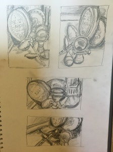
The corner in my office with the drums and rattles really intrigued me. It has been neglected since the children left home. There is a Sami drum from Lapland, a bodhrain from Ireland, a straightforward metal drum from who knows where?, and a couple of rattles…all in a corner….
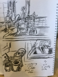
Here are the preliminary sketches, all in 8B pencil.
Of all the different viewpoints, and changing light…the sun kept coming in and out, my first gut instinct was the lowest one where the drums half disappear, and the skirting becomes part of the picture. But next some research.
Research:
Anthony Green is and English artist and a senior member of the Royal Academy. He trained at the Slade school of art where he met and married his wife. The council flat he grew up in became his studio, and his work was largely themed around family life, including his wedding anniversaries. (Green, A 2016a).
His paintings of interiors have a colourful and almost cartoon like hyper-realism, combined with the use of unusual viewpoints, sometimes used simultaneously in the paintings. (Green A 2016b)
Perspective is deliberately ignored or distorted. I think to approach this firstly I would need more practice in normally proportioned work, and then it is like superimposing three or four viewpoints into the work.
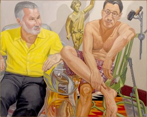
Philip Pearlstein is a US artist, from New York. He specialises in hyper-real portraits, but uses domestic interiors for his settings of faces or figures.
Pearlston P (1998) Portrait of John Anderson WatercolourPearlstein P (2011) Sandy McClatchy and Chip Kidd Oil on linen
Both these artists are stretching my ideas of what domestic interiors can look like, and do in contemporary art. Both have very colourful hyper real styles, so I searched out some other domestic interiors to expand my ideas further.
Walter Sickert often used domestic settings for his nude figures:
Whicker uses this pair of doors and pair of figures to create mystery, curiosity, the beginning of a narrative. The distant light coming through the far door and hint of a third figure entering add to the pull of the painting for me.
Reflection and Back to exercise 2
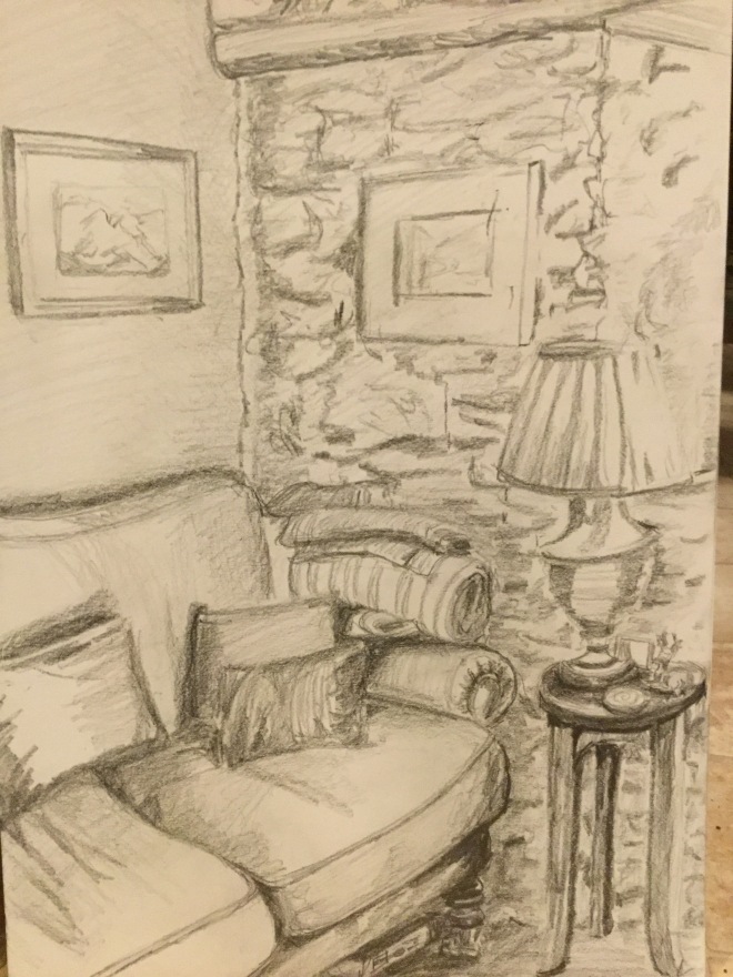
So now I am thinking that my little drawings of the drums are not really capturing a domestic interior, and I’d like to start again. Id like to try a sofa with a table and lamp I think…something I could work up to or work into a painting. So more compositional sketches….but I will also use those drums sometime too.
Second attempt:
The ones I like best are the first and the last.
The next part of the exercise is to produce 2 studies, adding shadow, one to be portrait and one landscape. Again I am using soft graphite pencil 6-7-8B.
This is A3 size:
I was trying to catch the sunlight coming in through the window, which is out of the picture, upper right. I think it catches this a bit. The blankets are piled up in the corner for cold days.
The next day the sun had disappeared, so the light was very different. The windows are small, so it was relatively dark, but I wanted to use the natural light. I used a teracotta conte crayon to give some warmth to the study. Again it is A3 size.
I found it was very easy to smudge accidentally with the terracotta crayon, so after one or two unintended accidents, worked from top left .
I became quite engrossed in this exercise and was surprised how many things I drew that I would not usually have thought to draw.
I used a range of drawing media:- conte crayons, Nitram charcoal in a holder, soft pencil, charcoal pencil, Koh-i Nor pencil. Some came out quirky…my collection of different sinks and watering cans. I really like the red crayon sketches especially the staircase. I also rather like the collection of drums and rattles I found in a corner although I have not drawn them particularly well here. I am tempted to use them for the next exercise.
I might also add more to this collection…see how my time goes.
Anthony Green is and English artist and a senior member of the Royal Academy. He trained at the Slade school of art where he met and married his wife. The council flat he grew up in became his studio, and his work was largely themed around family life, including his wedding anniversaries. (Green, A 2016a).
His paintings of interiors have a colourful and almost cartoon like hyper-realism, combined with the use of unusual viewpoints, sometimes used simultaneously in the paintings. (Green A 2016b)
Philip Pearlstein is a US artist, from New York. He specialises in hyper-real portraits, but uses domestic interiors for his settings of faces or figures.
Pearlston P (1998) Portrait of John Anderson WatercolourPearlstein P (2011) Sandy McClatchy and Chip Kidd Oil on linen
Both these artists are stretching my ideas of what domestic interiors can look like, and do in contemporary art. Both have very colourful hyper real styles, so I searched out some other domestic interiors to expand my ideas further.
Walter Sickert often used domestic settings for his nude figures:
Whicker uses this pair of doors and pair of figures to create mystery, curiosity, the beginning of a narrative. The distant light coming through the far door and hint of a third figure entering add to the pull of the painting for me.
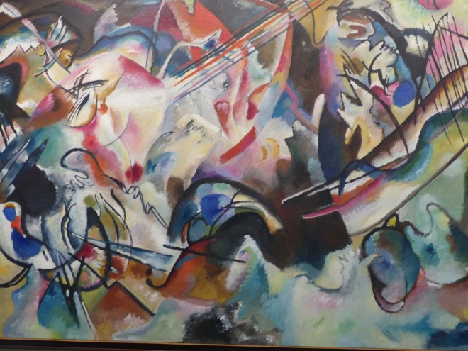
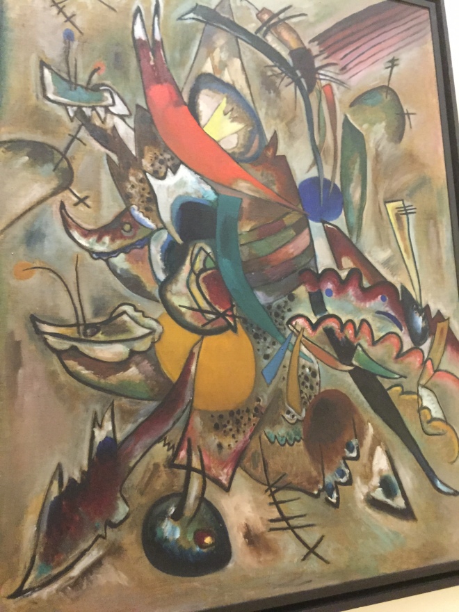
These are all taken from an exhibition of contemporary Russian art in the Russian Museum, St Petersburg.
These still life paintings were as big as a wall, and utterly fantastical
I cant translate the Russian, but I loved this painting which carries Kandinsky’s contradictions and contrasts…uprights and circular forms, hard sand and structure of trees with reflections, enhanced perspective pulling the viewer in.
This was such an amazing visit, and such an eye opener in the history of Russian art over the past thousand years, it is really difficult to know what to focus in on. We visited the Hermitage twice, and the Russian Museum twice. It is the latter which was the real expansion for me. Russian art rarely comes to the West so many of the artists were little or unknown to me, and painting styles and fashions were new (such as Russian realism and expressionism).
I will begin by focussing in on two artists whose work I want to explore more…one old and one contemporary, and then finish with a quick overview of some of the amazing works on view in the temporary exhibition of contemporary art we were lucky to view several times.
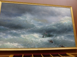
Ivan Aivazovsky (1817-1900)
I
I love the sea and all things connected with it, so Aivozovsky’s work was of great interest and also impact for me. The ninth wave, both featured above are not completely unfamiliar images. Both are oil on canvas. Nothing however can prepare for the impact of their size, colour and extraordinary rendition of light.
Aivazovsky travelled from the Ukraine to St Petersburg when he was just sixteen years old, Travelling by horse and carriage. He came to St Petersburg to study painting at the Imperial academy, on Vassilievsky island. Russian painting was just emerging internationally, with Schedrin’s landscapes, Briullov’s portraits and Venetsianov’s painting of Russian peasant life.(Caffiero and Samarine, 2013)
All the paintings are oil on canvas. His body of work is enormous…something like six thousand canvases, almost all of which are seascapes, shipwrecks, storms at sea, the effect of sunrise, sunset, light and moonlight on the water. Although he predates Turner, much of his work reminds one of Turner in its use of light. It is said that in his Paris 1842 exhibition, visitors looked behind the canvases for a lantern or light hidden there such was the effectiveness of his depictions of light. (Caffiero and Samarine, 2013) Key features of his work are:
The transparency of the water and waves
The airiness and drama of his skies
His use of intense colours
His ability to depict light
In terms of his technique, he did the following:
He rarely painted “plein air” : he saw painting as a process of recalling the pictures in his head, rather than painting what is in front of one, believing the latter approach to be no more than being a copyist. To him, a genuine artist needed to learn their subject intimately, to remember fleeting moments such as a wave splashing, a sudden gust of wind, lightening, a storm. He would then compose the picture from his memory, putting in the elements he wanted.
His sketches were very simple, maybe 3 marks to outline the topography.
He then discovered and marked the positions of sunrise, zenith and sunset to be able to accurately portray the lighting at these different times
He worked very quickly-a large picture in a day, a small one in a couple of hours.
The picture was composed in his head before beginning.
The speed allowed him to put down the whole wash across the sky in a single session, even if it lasted 8 hours, allowing a very thin, airy effect.
During the painting of the rest, he noted the visual centre, the point that would first catch the viewer and painted everything else in reference to that, constantly stepping back to look at and harmonising the whole. Detail became rougher and sketchier away from this centre…..an optical trick.
Thin washes for the sky contrast with thicker layers for rocks and land. Invisible brush strokes in the sky, or calm water contrast with brushwork to shape and model the land….foreground rocks and cliffs being built up with thick layers of impasto which he dragged his brush across. (Caffiero and Samarine, 2013)
Most of these techniques were well beyond the norms of painting in his age, but were extraordinarily effective in depicting atmospheric and dramatic seas, air, light. I am learning from this research into his techniques and applying it in my acrylic paint seascapes.
Wassily Kandinsky 1866-1944
“Colour is the key. The eye is the hammer. The soul is the piano with its many chords. The artist is the hand that plays, touching one key or another to cause vibrations in the soul” Kadinsky W
(Howard and Simpson, 2015)
Kandinsky, again internationally known is a complete contrast to Aivazovsky, but I equally responded to, enjoyed and wanted to learn more about his work. I loved his use of colour. He was born when Aivozvsky was already in his sixties, in Moscow. He loved colour from being a small child and was probably a synaesthete, with neurological brain wiring that allowed him to literally hear colours, patterns or textures. (Howard and Simpson, 2015 P 20)
He initially studied law and economics at Moscow University, became an Associate Professor of law, married his cousin, Anya and did not leave his legal career and Moscow to begin painting until he was 30. He went to Munich to study painting. (Howard and Simpson, 2015) (Barnett. Vivian Endicott 2016). Here he met Munter, who became his lifetime companion, and divorced Anya.
Russian and Finnish mythology and mysticism were huge early influences for him, especially the Kalevala, a Finnish epic poem. (Howard and Simpson, 2015). He was also very influenced by music-he was a cellist and pianist himself. Reportedly, after listening To Wagners Lohengrin:
“I saw all the colours in my mind; they stood before my eyes. Wild, almost crazy lines were sketched in front of me”(Howard and Simpson, 2015 P 19)
“To paint this hour I thought, must be for an artist the impossible, the greatest joy.”(Howard and Simpson, 2015 P16)
I am going to focus in on the middle phase of his output, when he was creating increasingly abstract works, and reputedly the first abstract painting in the world. His series known as the “compositions” he described as “consciously created expressions of a ‘slowly formed inner feeling, tested and worked over repeatedly and almost pedantically’” (Barnett. Vivian Endicott 2016) He saw music and art as analogous, so his paintings or “compositions” were like a visual symphony, with different notes, tones, rhythms and movements represented. (O’Neill, O’Neill and Staff, 1996)
He was committed to exploring the spiritual or inner life through his art, which was constantly growing and transforming itself. He wrote and his book “Concerning the spiritual in art” was published in 1912, and was a great influence at a time of transition in art and in music. He was searching for what he called “pure painting”. (Roskill M, 2016)
He had an unusual experience in his studio where he saw a vision in one of his own paintings that was so indescribably beautiful it appeared “saturated with an inner glow.”
“I returned home [at dusk] having finished a study, still dreamy and absorbed in the work I had completed, and suddenly saw an indescribably beautiful picture, pervaded by an inner glow. At first, I stopped short and then quickly approached this mysterious picture, on which I could discern only forms and colors and whose content was incomprehensible. At once, I discovered the key to the puzzle: it was a picture I had painted, standing on its side against the wall.”(Kandinsky, 1994) (in Roskill, M. (2016)
After this he saw “subject matter was detrimental to my paintings” (O’Neill, O’Neill and Staff, 1996) (Ayers, A.2016)
Key features of his work are:
The use of colour which is often intense, unnatural, and strikingly harmonious (Which would fit with his musical thinking of the visual)
Increasing abstraction. After an unusual experience in his studio, he saw “subject matter was detrimental to my paintings” (O’Neill, O’Neill and Staff, 1996) (Ayers, A.2016)
Use of oil paint either on cardboard or canvas (occasional woodcuts)
Expressive use of colour and form, often with one main form (sometimes not easy to see) and various other subordinate forms. (Duchting, Düchting and D, 2000)
Contrast and contradiction (Duchting, Düchting and D, 2000)
Used tempera and gouache but preferred oils and their “comparative ease of technique” (Turchin V 2011)
For nature studies, used a pochade box, canvas attached to cardboard and daubs of paint either from soft brushes, or using a larger spatula to hammer into the canvas, creating grooves especially in the foreground.
At times used pointillist techniques to create rhythms and gaps (arrived at this independently).
Suggests in a letter the following approach:Prime canvas with joiners glue
Cover with a layer of chalk solution
Lay pigment out in a set order on the palette, knowing the order like a “pianist would know his keys”
Squeeze out plenty of each colour, looking all the time at the natural world
Have plenty of brushes available.
Use pure colour wherever possible…too much mixing leads to dirty colours.
Here I reproduce the complete quotation on colour:
“Seek light, strength, colours. For nothing in Nature is bereft of colour, there is no white or black, colour is burning and shining everywhere and God save us from ignoring that. Nature is the best teacher in this respect. Understand Nature as you will but take what you can of her riches and revelations.
In my opinion, when studying pigments you need to go from the simple to the complex. Nowadays factories make hundreds of varieties enough to make our heads spin (endless “permutations” and “combinations”
At first your palette needs to be as simple as possible, but as time goes on our eyes grow dulled and start demanding refined delicacies, but the longer it is simple the better.
To start with buy-white:zinc white; greens: chromium oxide and permanent; blues: cobalt and ultramarine blue; reds; English, Turkish and dark madder lake, and red lead; yellows: light ochre, natural terra di Siena, light and orange cadmium; probably Indian yellow as well; browns: burnt terra di Siena; you don’t need any black mummy”.
In the last of these letters known to us, Kandinsky advises: “In painting we must above all seek contrast, i.e., apply the whole force of your palette to create an abyss between light and shade. Half-tones, half-shades, and all kinds of variations in light and shade, all of this comes later. Otherwise you will waste a lot of time on difficult studies.When studying nature (I mean becoming acquainted with her) the first thing is to convey her strength, as far as the palette allows. This is achieved through extreme contrasts between light and shade (especially in the sun). Don’t think that the more white you use the more light there will be in the painting. On the contrary! White kills light. Try to convey it using other light colours and, most important, by contrast with shade.” in Turchin V 2011 (my italics for my own learning)
10. Early works in tempera done on black cardboard; later works in oils done on light or white primed canvas. Sometimes combined oil and tempera.
11. Used very thick paint when working in oils.
12. Later used very thin layers on white paper with watercolour and very thin layers on white canvas with oils….which gave greater intensity of colour.
I will put some of the contemporary art I saw on a following post.
Sources:
Caffiero, G. and Samarine, I. (2013) Light, water, and sky: The paintings of Ivan Aivazovsky. United Kingdom: Laurence King Publishing.
Duchting, H., Düchting, H. and D, H. (2000) Wassily Kandinsky, 1866-1944: A revolution in painting. Germany: Taschen GmbH.
Howard, A. and Simpson, A. (2015) This is Kandinsky. United Kingdom: Laurence King Publishing.
“Colour is the key. The eye is the hammer. The soul is the piano with its many chords. The artist is the hand that plays, touching one key or another to cause vibrations in the soul”
O’Neill, B., O’Neill, B. and Staff, P. (1996) The life and works of Kandinsky. Bristol, England: Parragon.
Turchin V (2011) Kandinsky and technique. Craftsmanship and virtuosity InCoRM Journal Vol. 2 Spring-Autumn http://www.incorm.eu/journal2011/kandinsky%20and%20technique.pdf accessed 27 April 2016
Images:
Aivozovsky I (1850) The Ninth Wave Russian Museum St Petersburg Photograph by Palmer E (2016)
Aivozovsky I (1889) The Wave Russian Museum St Petersburg Photograph by Palmer E (2016)
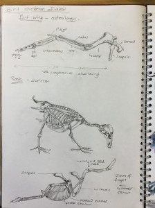
For this exercise, I wanted to study a birds skeleton, and because we have so many rooks around the house, I decided to study the skeleton of a rook specifically. I used several sources (Wootton T 2010, Simblet S 2005) and also looked at some of the work of Katrina van Grouw, author of “The unfeathered bird” (van Grouw 2012).
I was not sure exactly how I might approach this exercise, so I began with some sketchbook studies of the rooks skeletal structure, based on my sources.
sketchbook page
I learned a lot about the skeletons of birds…..how the sternum is larger to anchor the pectoral muscles for flight, the way the four digits of the legs are arranged, the relative inflexibility of the spine, the way the bones are aerated for lightness to aid flight. I was particularly interested in the skeletal structure of the wing, which I drew first. At the bottom of this page I have drawn a pair of wings, with the sternum, scapulae and wishbone.
Bones seem close to the core….the structural essence of living things……my bones will outlive me maybe by centuries. Flight is such an extraordinary, non human activity, discounting aeroplanes and I began to focus in on this central bony structure for flight. I wondered how it would be to redraw the bones and find a way to give them wings, or at least some feathers. I wanted the bony framework to show through the feathers, so would need a transparent top layer, with something underneath to show the bones.
These are my experiments:
sketchbook work
I used an Indian ink marker pen, and watercolour wash for the bones and did various experiments with watercolour mixes over dip pen/Indian Ink bones sketched below.
I also sketched an pencil/oil pastel/baby oil rook, which uncannily (it was not planned that way) shows through as a ghostly image over the flying bones above……
This was the final exercise on A2 Hahnhume paper. Because of the size, I used a bamboo pen and Indian ink to sketch the flight bones. The feathers I left very soft and loose as a contrast to the hardness and solidity of the underlying bones. Overall I wanted to give an impression of body-less flight.
I like the idea…and may come back to develop it further at some stage. The image has become ambiguous somehow…it is bones of flight, but it keeps looking to me like someone simultaneously doing a yoga exercise….my strange mind maybe? I still need to sign it and may put a line of corvid inspired poetry top left, in gratitude to Ted Hughes whose biography I am reading just now.
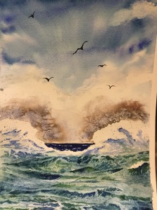
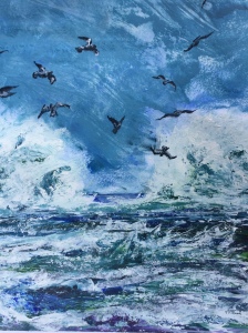
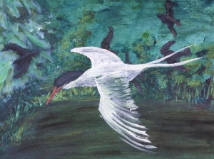
I finished up doing three paintings with birds, and another drawing:
Peregrine falcon (stationary); goose and wader (ready to fly) and eagle in flight. Charcoal, graphite on A2 Hahnhume paper
Birds and ocean, watercolourInto the Storm acrylic on acrylic paperArctic tern acrylic on acrylic paper
Sources :
Wootton T (2010) Drawing and Painting birds Crowood Press, Marlborough
Simblet S (2005) Dry Birds P45-6 in The Drawing Book Dorling Kindersley, London
van Grouw K (2012) The unfeathered bird http://www.unfeatheredbird.com/gallery.html accessed 4.4.16


 I
I


