Thinking about the objects chosen, composition and what has been learned so far about still life, this first exercise asks the student to compose and draw a still life, using pen and ink, and line only.
The objects I chose formed a theme that somehow fascinated me that in my sketchbook I called “Containers for life.”
Bit ghoulish, but I have a Lakeland sheep’s skull which I found mountain walking years ago. It had sat on top of my drawing box for a couple of months, as I really wanted to draw it…the bones visible at the back of the eye socket, the way the light still comes through although the eyeball is long gone. So this, yet another seashell, chosen partly because it was in my far flung daughters room, but also because I have an intention to paint it. This is Redon’s painting of an almost identical seashell.

Redon’s wife was the owner of the shell, and it is a recurring motif in his many paintings of the Birth of Venus (Gibson 2011).
When he turned from his noir images towards colour, he used pastel and watercolour to create his works, referring to this as an attempt to “open a little door to mystery” (Bayle 2011)
The third object was another seashell…..not quite a scallop shell, but the closest I could find in honour of Maggi Hambling, whose work I am exploring and who I am writing about separately at the moment.

So, as ever, I played because I am not so familiar with dip pen and ink and wanted to use the exercise to get plenty of practice.
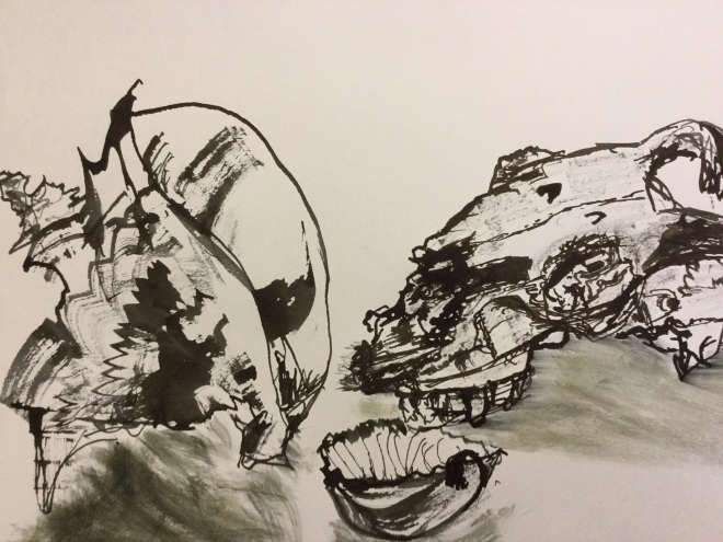


The variations include dip pen and Quink, dip pen and Indian ink, stick and ink and the one done in deep red ink is with a bamboo pen. They are all on cartridge or sketchbook paper, A3 size (my thumbnails are terrible) and in two I have tried incorporating a background. Aesthetically, my eye prefers the three objects without a background, and I also think the backgrounds detract from the strength of the idea I was trying to convey. Each of these objects held life.
I played a bit more, because my pad of black paper and white conte pencils had arrived.
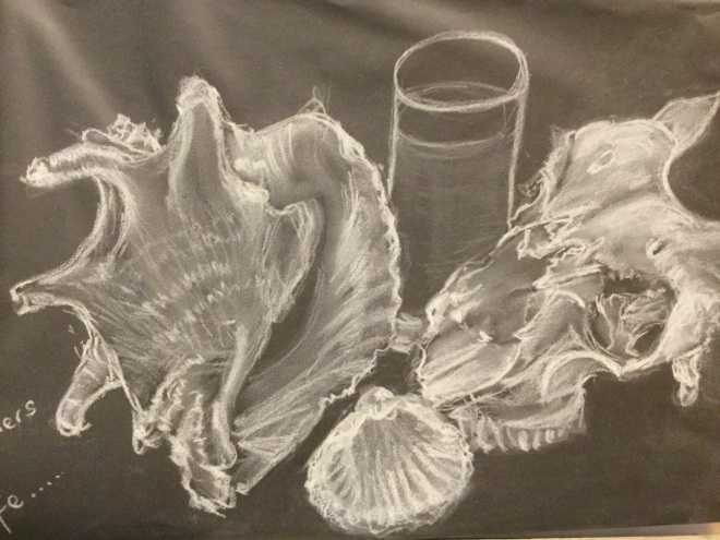
I thought this was a medium that worked well with the subject matter I had chosen.
This is the final piece I did.

It is drawn with dip pen and Quink, A3 size on cartridge paper . I cheated and put small amounts of tone in the shell. The shadows are made by drawing out the ink with a moist baby wipe. I like the idea and somewhere down the line may well come back to it and develop it a bit more.
Refelection:
What worked well was dip pen with fine nib, using some of the line making I had explored in the texturing exercise.
What I would change/do differently If this was not an exercise, white pastel, conte pencil and even white acrylic ink on black paper would be interesting ways forward. Although use of background/foreground was suggested I thought it detracted a bit here. Maybe an unstructured background like Van Gogh used in Two Crabs (National Gallery Visit) would work, or a suggestion of cloth or silk.
I sometimes wish I could capture the essence of objects with a few sweeps of a brush or bamboo pen, but maybe thats some decades hence.
Sources:
Gibson M 2011 Redon P 15 Taschen, Koln
Bayle, F 2011 A fuller understanding of the paintings at the Orsay Museum Artlys Musee d’Orsay Paris
Images:
Redon O 1912 Seashell La Coquille Pastel Musee du Louvre, Paris in Gibson M 2011 Redon P 15 Taschen, Koln
